

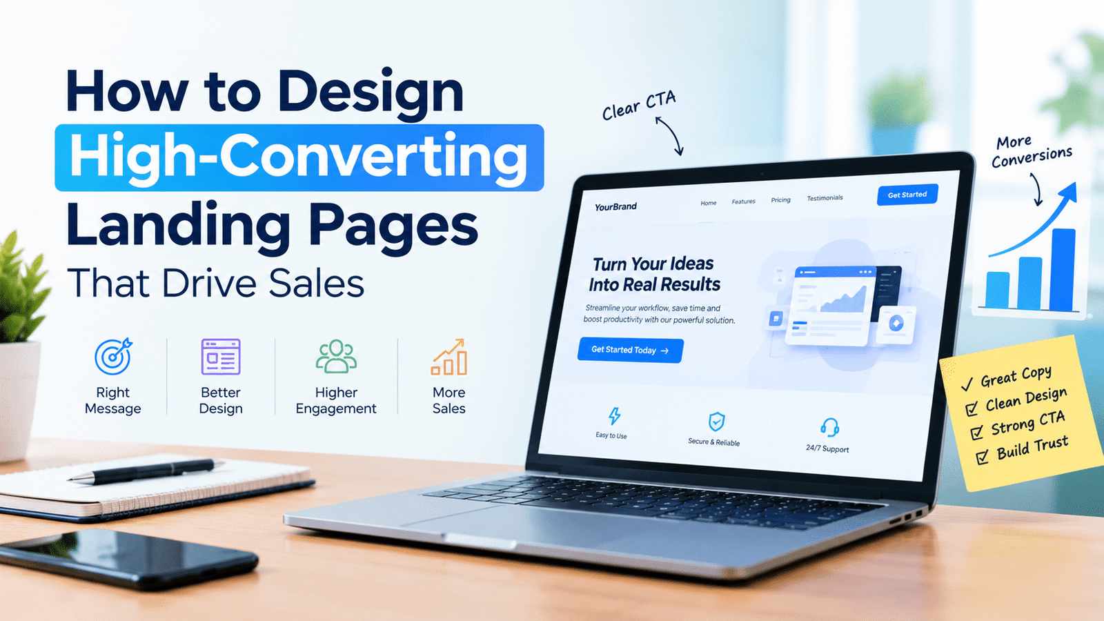
I have watched a lot of companies pour thousands of dollars into ad campaigns, only to send that traffic to a landing page that was basically an afterthought – something a founder threw together in an hour because “the site needed one.” Then they wonder why the conversion rate is sitting at 1%.
Here’s the uncomfortable truth: your ads can be flawless, your targeting dialed in perfectly, and none of it will matter if the page people land on doesn’t do its job. Landing page design isn’t decoration. It’s the moment where interest either turns into a customer or quietly disappears.
I want to walk through what actually separates a page that converts from one that just sits there looking nice.
What “High-Converting” Actually Means
Everyone throws around the term high converting landing pages, but in practice it usually comes down to three things working together: the page is instantly clear, it feels relevant to whatever brought the visitor there, and it doesn’t give them any reason to hesitate.
Clarity sounds obvious, but you’d be surprised how many pages fail at it. Someone lands on your page and within a couple seconds should know what you’re offering and why they should care. If they have to scroll around trying to figure that out, you’ve already lost a chunk of them.
Relevance is the piece people skip most often. If someone clicked an ad about “free shipping on running shoes,” and they land on your generic homepage, that mismatch kills trust instantly. The page has to feel like a continuation of the thing they just clicked, not a detour.
And then there’s momentum – every part of the page should be quietly pushing the visitor toward one action. Not five actions. One.
What a Page That Actually Sells Looks Like
The headline has to earn its place
Don’t get cute here. I’ve seen so many headlines that sound impressive but say nothing – “Innovative Solutions for the Modern Enterprise” type stuff. Nobody responds to that. Say the actual benefit. “Cut Your Onboarding Time in Half” beats vague corporate speak every single time, because it tells people exactly what’s in it for them.
The subheadline should answer “wait, how?”
Right after your headline, someone’s brain is asking a follow-up question – how does this work, or who is this actually for? Your subheadline’s job is to answer that before they even have to ask.
Guide the eye, don’t make it search
This is where landing page UX and visual design really overlap. Size, spacing, contrast – all of it should lead the eye through a sequence: here’s the hook, here’s the proof, here’s what to do next. If someone has to hunt for the button, that’s a design failure, not a minor detail.
A few things that consistently make a difference:
- Bigger and bolder should always mean more important – don’t bury your key message in the same visual weight as the fine print.
- Whitespace isn’t wasted space. It’s what makes your call-to-action feel like the obvious next step instead of one option among many.
- Save your boldest color for the thing you actually want clicked. If everything’s colorful, nothing stands out.
- People read in predictable patterns (roughly F-shaped or Z-shaped) – work with that instead of against it.
Put social proof where it actually counts
Testimonials and logos help, but only if they show up at the right moment. Dropping a great testimonial right before or after your call-to-action does more work than burying five of them in a scrolling carousel nobody reads.
Pick one call to action and stick with it
I can’t stress this enough – pages with “Buy Now,” “Learn More,” and “Sign Up” all competing for attention convert worse than pages with just one clear ask. Decision fatigue is real. Give people one door to walk through, and make it obvious.
The UX Stuff Nobody Notices Until It’s Broken
Good landing page UX isn’t something you sprinkle on top after the design’s done – it needs to be baked in from the start. A few things I see get overlooked constantly:
Page speed matters more than people think. Every extra second your page takes to load, you’re losing people – especially on mobile, where patience is basically zero.
Speaking of which, design for mobile first. Most of your traffic is probably arriving on a phone, so if your page was designed for desktop and just “shrinks down okay,” you’re already behind.
Forms are where a lot of conversions quietly die. Every extra field you add is a small excuse for someone to bail. Ask for the bare minimum you need right now – you can always ask for more later once they trust you.
And don’t hide your trust signals in the footer. If someone’s about to fill out a form or make a purchase, your guarantee, your security badge, whatever reduces their risk – it needs to be right there, not three scrolls away.
Should You DIY It or Bring in a Pro?
There are some genuinely good landing page builders out there now – drag-and-drop editors, templates, built-in A/B testing. For a lot of smaller campaigns, that’s honestly enough, and I wouldn’t tell someone to overspend on a page that doesn’t need it.
But here’s the thing a template can’t do: it can’t tell you which headline will actually land with your audience, or where your specific funnel is leaking people. It gives you the pieces – not the strategy behind arranging them.
That’s usually where landing page design services come in. A good specialist isn’t just making things look nicer; they’re bringing conversion research, copy testing, and an eye for the small frictions that templates miss. If you’ve got real ad spend riding on a page, that expertise tends to pay for itself pretty quickly.
My honest take: if it’s a quick internal campaign, a builder is fine. If it’s your main product launch or a page carrying serious paid traffic, it’s worth having someone who does this for a living take a pass at it.
Don’t Skip the Testing
A landing page is never really “done” – it’s more like a working theory you keep testing. Headlines, button copy, images, form length – all of it can be tested, and what wins is often not what you’d guess.
Start big: test your headline and your call-to-action first, since those tend to move the needle the most. Once those feel solid, move on to smaller stuff – button color, where the testimonials sit, how many fields are in your form. And trust the data over your gut, even when the results are annoying or unexpected.
Bottom Line
A landing page that actually converts isn’t the result of one clever trick – it’s a headline that means something, a layout that guides people instead of confusing them, UX that removes friction instead of adding it, and a habit of testing instead of assuming you nailed it on day one. Whether you build it yourself in a template or hire someone who does this full-time, the fundamentals don’t change: clarity wins over cleverness, and every piece of the page should be working toward the same goal – getting someone to say yes.
The businesses that treat their landing page like a living thing they keep improving, instead of a box they checked once, are the ones actually turning their traffic into revenue.